By martinmine on Dec 29, 2019 at 11:59 PM
  1. martinmine

    martinmine Server Engineer
    Staff Member Administrator

    Joined:
    Aug 6, 2019
    Messages:
    374
    Likes Received:
    265
    Trophy Points:
    63
    What's new?
    For a while now we have been working on redesigning the launcher from top to bottom. Together with an entirely new and fresh looking user-interface, bits and pieces of what is under the hood have been tweaked, improved, and updated.

    For those who are interested in the technical details, feel free to check out the pull request that highlights the changes in this version: https://github.com/ProjectCeleste/Celeste_Launcher/pull/38

    This is a pretty big change to the launcher, and we are taking things slowly in order not to break too many things at the same time. Therefore, some of the old user-interface is still hanging around at some parts.

    In this first wave of changes, we have focused on redesigning the most essential elements of the launcher and getting the foundation ready for the next changes we have planned ahead.

    We want to highlight that this is a beta release which can contain a few bugs. If you encounter any bugs, please let us know in this forum thread so we can fix them.

    Feature highlights:
    - Redesign of the following components:
    • Main menu
    • Account Overview
    • Game Scanner
    • Launcher Updater
    • Game Language Selection Screen,
    • Login Screen
    • Register Screen
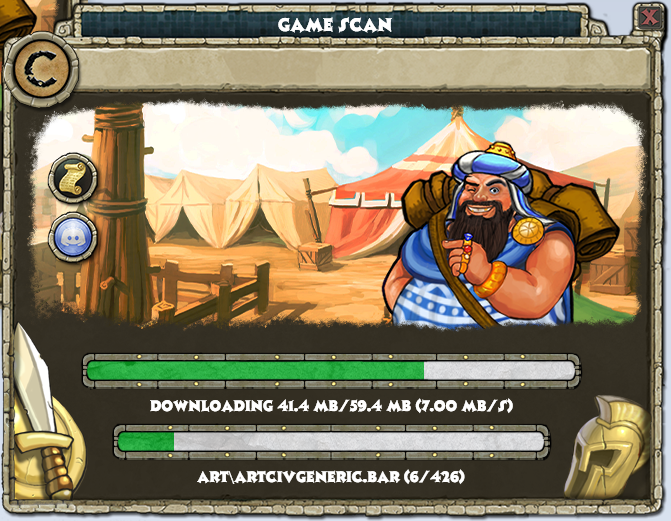
    - A game scanner that is more responsive, that also shows the download status on the task bar.
    - Many small improvements from a technical and security point of view

    You can find the new launcher here.

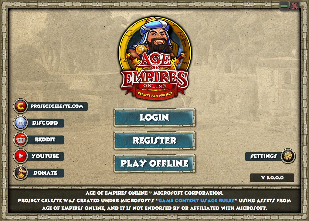
    Screenshots
    KWaGvNQ.png
    AZBsPzl.png

    HelS23n.png


    We want your feedback!
    We would love to hear your thoughts on the changes, especially if some things should be done differently, or if you have any feature requests yourself (we might not be able to deliver anything like Skynet, so please try and stay realistic :).

    What lies ahead
    Our top priority will be to fix new bugs that are introduced in this redesign process. After this we will migrate the old elements of the launcher to the new, fancy design. There are also other changes in our backlog such as avoiding having to start the launcher as administrator every single time, and having the launcher translated to different languages.

    Who am I?
    Some may not recognize my username, but I started working on this redesign together with @PF2K some months ago. I am a full-time software engineer that work on writing corporate software during my day-time. To get some more fun out of writing software I wanted to start contributing to some game, and I noticed that the launcher was quite ready for an overhaul when @PF2K introduced me to project Celeste a while ago. This does also go some into the roots of where I started programming, as I started working on private Habbo servers as a kid.
     
    Mikey242, Rataheavy, BOSAIF and 14 others like this.
  2. Loading...


Comments

Discussion in 'News' started by martinmine, Dec 29, 2019.

    1. TheSpaniard

      TheSpaniard Berserker

      Joined:
      Jan 15, 2019
      Messages:
      128
      Likes Received:
      238
      Trophy Points:
      43
      I love the new look! Well done to both of you.

      Small question: any chance of linking the Twitch channel on the launcher as well? Or don't want to/can't?

      Thanks for all you all do for the game!
       
      kevin armando, Ardeshir and Eery like this.
    2. SlyCooperFan1

      SlyCooperFan1 Spearman

      Joined:
      Nov 16, 2019
      Messages:
      7
      Likes Received:
      6
      Trophy Points:
      3
      This is such a better design! I'm very glad to see you guys tackling a 3.0 release of the launcher, as right now it's kind of all over the place.

      I gotta be honest, though, I'm not liking the second screenshot. It's information overload. It took me a while to see the version number hidden in the middle-bottom-right. There's so many outside links, on both sides. I would even get rid of the giant Forums banner, unless that's being used for current events or latest updates, in which case... well, hmm. I'm not sure.

      Also, on the first screenshot, "projectceleste.com" should really just say "Website" like it does in the second screenshot. No need to keep it that wide, plus anyone who got the launcher will know the URL.
       
      kevin armando and martinmine like this.
    3. Ardeshir

      Ardeshir Immortal

      Joined:
      Apr 8, 2019
      Messages:
      981
      Likes Received:
      526
      Trophy Points:
      93
      Looks really really clean hey?

      I'll give it a go too
       
    4. Andy P XIII

      Andy P XIII Moderator
      Moderator

      Joined:
      Nov 14, 2017
      Messages:
      562
      Likes Received:
      837
      Trophy Points:
      93
      I continue to be amazed at all the smart people who join in to help out around here. Everyone throws their own skill set in the pot, and the results are incredible. Thanks, guys. You are wizards and magicians, as far as I am concerned.
       
      Ardeshir, Servimomia and rtsgamer like this.
    5. MatrixSoft

      MatrixSoft Champion

      Joined:
      Jul 29, 2018
      Messages:
      52
      Likes Received:
      88
      Trophy Points:
      18
      It was very good, excellent work, looking forward to doing the work in Portuguese Brazil
       
    6. Ardeshir

      Ardeshir Immortal

      Joined:
      Apr 8, 2019
      Messages:
      981
      Likes Received:
      526
      Trophy Points:
      93
      My only complaint/report so far would be that underscores in the name of the logged-in user don't display, and so clan tags, or users with spaced names will have their names bunched up, but this is only pretty minor (friends list name underscores function as intended from what I can see). Otherwise, it seems more responsive than the release client, and nothing is doing anything it shouldn't!
       
      martinmine likes this.
    7. martinmine

      martinmine Server Engineer
      Staff Member Administrator

      Joined:
      Aug 6, 2019
      Messages:
      374
      Likes Received:
      265
      Trophy Points:
      63
      That's a great idea! Battle.net launcher has a feature which notifies you when something is live. I think this is something we can address once all the UI has been re-implemented. I'll consider adding a Twitch link and swap out one of the others.

      Thanks a lot for the feedback! I agree that there are quite a few options on the main overview screen. Otoh, the version number is not something that is very crucial to players, hence it is not something that is given much attention. The most important is the play button which has some space around it to stand out from the rest. There are some things I find a bit strange myself with how the UI is, but it is something we can address in the future. What is really nice with this redesign is that it allows us to make changes to the UI easier than before. So this is something we definitely might revisit in the future but I think for now it is good enough as-is.
      The forum banner is just a placeholder for what you guessed :) If you look closely there is a tiny yellow pixel, which is to indicate it is a sample picture I uploaded.
      I completely agree with you on the website links, and I have made a task item to address this issue shortly.
      Thanks for letting us know! I will investigate to figure out why this is happening :)
       
      #8 martinmine, Dec 30, 2019 at 11:49 AM
      Last edited: Dec 30, 2019
    8. Fraxure022

      Fraxure022 Berserker

      Joined:
      May 18, 2019
      Messages:
      141
      Likes Received:
      150
      Trophy Points:
      43
      An item search?! I am in love. Phenomenal.
       
      Andy P XIII likes this.
    9. Alzerus

      Alzerus Champion

      Joined:
      May 4, 2019
      Messages:
      72
      Likes Received:
      86
      Trophy Points:
      18
      Great news on the fact you are updating the launcher and tweaking the inner workings of it, but having to be honest, I think the first window (Main) is way too empty, the second window (Account) is way too overcrowded, like get me out of here quickly, but the third window (Gamescan) looks absolutely great.

      My two cents is that there is far too much emphasis on the AOEO Celeste logo which is way to large, could be half/third the size and still be easily seen as it's a very noticeable logo anyway. The logo takes up way to much space being in the center. In the Account window, the "Play" button should be under the Log in info. When I select a game launcher on my desktop, I already know what game I am about to play, maybe place that emphasis on the desktop launcher icon instead.

      Sorry to be negative, but feedback is feedback and I really appreciate the amazing work you guys to and continue to astound us all.

      Happy New Year to you all too :)
       
    10. SlyCooperFan1

      SlyCooperFan1 Spearman

      Joined:
      Nov 16, 2019
      Messages:
      7
      Likes Received:
      6
      Trophy Points:
      3
      Totally agreed, but what's more important there is the hammer that has some important options within it. Maybe the version number can be hidden inside the hammer's dropdown menu and the hammer icon itself moved next to the Play button? I suppose then the question becomes what to do with that space. I'd suggest removing it and expanding the Play button area, but then that would require fiddling with the icons on the right... idk, the double icon set and the version number just seems a little too cluttered atm.

      I suspected as much, the old launcher being built in WinForms certainly didn't seem easy to modify :yum: There's something about recreating something almost from scratch to be much more streamlined and efficient that just pleases the inner programmer in me. I'm playing the game through Steam so I don't want to potentially mess things up by installing this beta, but I can't wait to use this :blush:

      I completely missed that :sweatsmile: If that's the case, how will it slide between images? Right now we have a big banner with two arrows, but I don't see how that might fit in the new design.
       
      Ardeshir likes this.
    11. martinmine

      martinmine Server Engineer
      Staff Member Administrator

      Joined:
      Aug 6, 2019
      Messages:
      374
      Likes Received:
      265
      Trophy Points:
      63
      Currently it is limited to just one picture, but this is something we can iterate over later once we get further in development. Thanks again for the constructive feedback, it is super helpful for improving the launcher! :)
       
      Andy P XIII and SlyCooperFan1 like this.
    12. MainMan B

      MainMan B Berserker

      Joined:
      Feb 23, 2018
      Messages:
      143
      Likes Received:
      69
      Trophy Points:
      28
      Do you have to uninstall the current launcher, to use this?
       
      Ardeshir likes this.
    13. martinmine

      martinmine Server Engineer
      Staff Member Administrator

      Joined:
      Aug 6, 2019
      Messages:
      374
      Likes Received:
      265
      Trophy Points:
      63
      There should not be any problem using them side by side by having the binaries in separate locations.
       
      Andy P XIII, MainMan B and Ardeshir like this.
    14. Ardeshir

      Ardeshir Immortal

      Joined:
      Apr 8, 2019
      Messages:
      981
      Likes Received:
      526
      Trophy Points:
      93
      Installs/reinstalls between the 3.0 beta and the existing release version is as easy as copypasting into the same folder and yes to overwriting all anyways (you won't need to gamescan either), so I'm just keeping download copies of both and sticking with 3.0 beta for now!
       
      MainMan B likes this.
    15. martinmine

      martinmine Server Engineer
      Staff Member Administrator

      Joined:
      Aug 6, 2019
      Messages:
      374
      Likes Received:
      265
      Trophy Points:
      63
      I've addressed some of the feedback that's been surfacing in this thread. The new build can be found here.
      This is what has changed:
      - Consistently refer to Celeste website as 'website' (thanks to @SlyCooperFan1)
      - Swapped item search with Twitch link (thanks to @TheSpaniard)
      - Fixed an issue preventing _ in usernames being displayed (thanks to @Ardeshir)
      - Set correct default news image (minor tweak I noticed)
       
    16. Kulcsos12

      Kulcsos12 Hippikon

      Joined:
      Nov 15, 2017
      Messages:
      181
      Likes Received:
      214
      Trophy Points:
      43
      The new design is awesome! I love it. However, the "Logged out" and "Logged in" screens are too different.
      The options in the "Logged out" Settings are separated in the "Logged in" screen in the Settings and the Hammer and some of them are different. For example, on the Logged out screen we see a "Convert to Steam Game" option, while in the Logged in screen it is just "Steam". "Check for updates" change to "Update laucher", "Change game language" change to "Game language". These should be the same in both screens.
      And the Patch Notes button has a wrong link. Its lead to the "Announcements", not to the "Patch Notes".
      Plus a suggestion: Make a dropdown menu for the "Website" and put in the Celeste website, the Item search, the Unit stats and the PvP info.
       
    17. SlyCooperFan1

      SlyCooperFan1 Spearman

      Joined:
      Nov 16, 2019
      Messages:
      7
      Likes Received:
      6
      Trophy Points:
      3
      Ooooh, I like this idea. This would add some space to the logged-in screen, making it seem less cluttered while not losing the functionality, and allowing for moving around the hammer and version info.
       
      Ardeshir likes this.
    18. LordGalahad

      LordGalahad Spearman

      Joined:
      Sep 7, 2019
      Messages:
      7
      Likes Received:
      0
      Trophy Points:
      1
      Is throwing a bug in the registration area, even by posting an existing email, the launcher claims that it is invalid if it can resolve thankfully from the heart!

      [​IMG]
       
    19. Pr1nc3

      Pr1nc3 Villager

      Joined:
      Dec 5, 2019
      Messages:
      2
      Likes Received:
      1
      Trophy Points:
      3
      Launcher design is super important! Don't bother implementing save load feature for offline mode, it's cool.
       
  1. This site uses cookies to help personalise content, tailor your experience and to keep you logged in if you register.
    By continuing to use this site, you are consenting to our use of cookies.
    Dismiss Notice